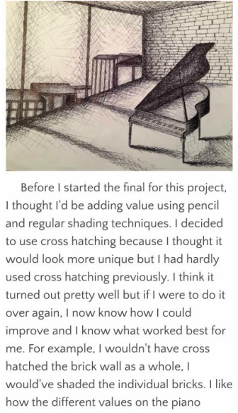
   My artwork "Piano Room" is a pen and ink drawing with the shading done using cross hatching. It features a grand piano in an otherwise vacant room with wall-to-wall windows. The windows' view implies that this room is in an upper-story loft.The most challenging part of this project was adding value by cross hatching. This project took me about two weeks, and the majority of that time was taken up by shading; drawing the mere outlines of things took me almost no time. I know that all methods of shading take time, especially when you're working with such a large area, but since I already get impatient with these types of things, tediously cross hatching for over a week caused me to rush towards the end. It was difficult having to make every line trail off to a focal point, especially since there are two of them and they're both way off the paper. I like how everything ties together nicely in unity, even with the asymmetry. In my original compositional sketch for this, there were no buildings in the window and the wall behind the piano was blank. I realized that although I wanted the piano to be the number one focal point, but there was too much empty space and it needed more variety. I think when a viewer would first look at this artwork, their gaze would go from the piano, to the window, and then to the back wall. Those are really the only three things with much emphasis, and they create the movement within the picture themselves because of their significance, not necessarily their placement. The shadows help to create the mood by indicating the time of day, as well as making everything look more realistic and textural. I added the buildings and turned the wall into a brick wall and I think it looks ten times better than it would have had I not added them. After adding these elements, the viewers attention is still initially drawn to the piano in the center of the room. By the time I completed this project, my skills using pen and ink improved a lot, and now it's one of my favorite types of media. I didn't use any color because I wanted to experiment with pen and ink; however, I'm glad I didn't use color because it adds to the simplicity of things and adds to the overall feel. The still inanimateness of things is what makes this picture so cool, in my opinion. The mood created is my favorite aspect of this drawing, and it turned out just how I thought it would. The calming tone sets a mood that I think viewers can interpret as either relaxing or almost unsettling, due to the stillness. I think the buildings add a lot because it implies that there is a loud, bustling city scene going on just outside the window, and it contrasts with the serene vibe of the piano room. I feel like you could walk into the picture and you'd be standing in a quiet room with only the distant sounds of the city outside, and if someone were to step in and start playing the piano, the music would echo throughout the room. Nothing I drew is so realistic to the point where it looks like a photo, but the perspective of it makes it really come alive. The difficulty of making every element in the picture be perfectly in perspective allows everything to be to in correct proportion and it paid off. 1. My canvas painting was most successful. It took my the longest to complete, and I think I did the best job on that one. I liked the picture I had of the candy store in downtown Winter Park and thought it would look good as a painting; however, I don't think it looked as much like Edward Hopper's work as I thought it would based on the photo I was working off of. I definitely learned a lot about creating my own paint colors because I had a lot of various neutral shades, and it was hard at first to mix them and find the right balance of basic colors. I hadn't painted a canvas with acrylic paints for a long time, so I basically learned the process as I went through it. I think using acrylic paint was a great choice for this project because of the vibrancy and detail. 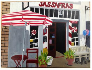 2. The first piece that shows my growth as an artist is my painting. In the painting itself, I don't think the growth is too visible, but it's because I redid all the parts I didn't like (perks of acrylic paint). To start off with, there are tons of bright colors in this, including shades of the same colors, and it was hard for me to get the "color mixing" process down. The detail was kind of difficult since I made the poor decision of working with basically the same one brush the whole time, but now I know that it could've been a lot easier if I'd taken advantage of all the materials I had. The reason I like this painting so much is because it turned out pretty much how I thought it would, and because it has an actual meaning to me. I feel like I usually do art based around visuals, and it was really cool to paint something kind of nostalgic that reminds me of Winter Park and all my friends and family. The second project that shows my growth as an artist is my print of the Great Barrier Reef. This was the most aggravating project for me all year, but I probably got the most out of it. Unlike my painting, you can definitely see my struggles/growth among all my different prints. Everything done in this project was a new concept for me. I learned how to cut out the linoleum, what to cut and when to cut it, how much ink to apply to the linoleum, and how to line up my paper and linoleum. I one hundred percent want to do printmaking again because I basically count the first one as an experiment. I feel like it's kind of sad that the one I posted to my blog is the one that turned out best, especially because I had six options, but I like how it's not perfect and I can can compare to prints I'll do in the future and see my growth. Because lots of layers didn't line up and spots are missing ink, creativity played a big role in this project for me. If all prints were supposed to be precise and neat, mine wouldn't make the cut, but I love that I can look back on each separate print and see what went wrong and how to fix it in the future. 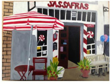 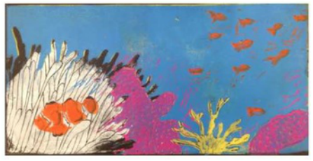
0 Comments
|
