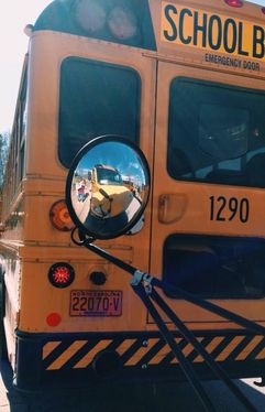
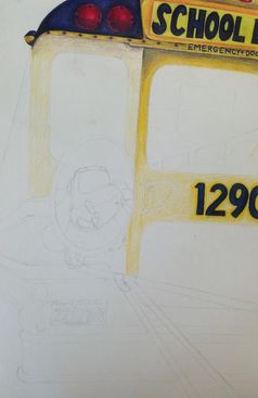
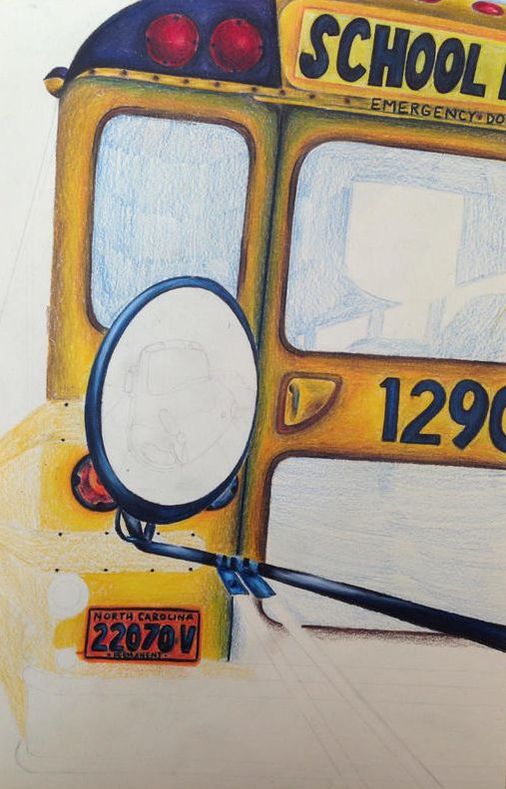
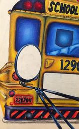
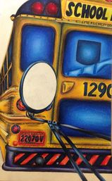
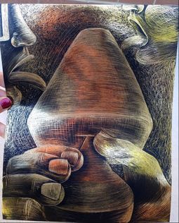
School Bus Reflection
|
|
|
|
|
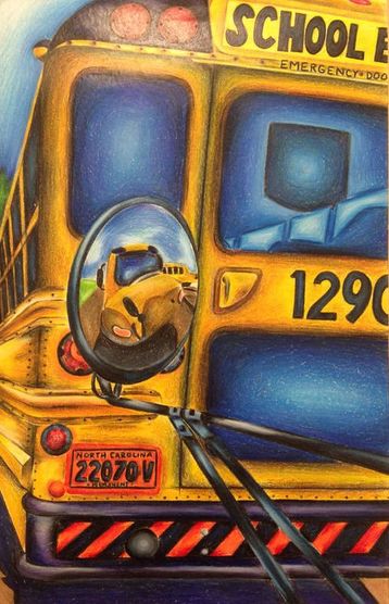
I was dreading this drawing because I'm not the biggest fan of Prismas. I always like the end result, but the process is tedious and not super fun for me. That pretty much stands true for this piece, but I love how it turned out. I think it's a unique perspective, like how the side of the bus is at an extreme angle and trails off for seemingly forever. I like how the edge of the bus and paper aren't parallel and how the words and numbers are cut off. I also like the colors I chose for everything- the blue windows, the black and orange stripes at the bottom, the brown edges, etc. My favorite sections are the bottom left of the bus with the license plates and lights and the bottom of the bus. The orange makes it stand out more from the yellow. I also think I did a good job with the highlights in the mirror and that it actually looks like the black metal that it is. My style isn't super realistic because of the colors I use and my inability to draw things super accurately, which makes me nervous in the beginning of any art piece. I started out with the font and hated it because of the letters' thickness and different sizes and blurry edges. Now I think it matches the rest of the drawing because of those reasons and looks better because of it. My least favorite part is the reflection. It looks cartoonish because the rest of the bus has more detail. I also went way too dark on the shadow because the bus looks more brown than yellow and I couldn't bring back any highlights because the paper was too waxy. I always regret it when I save the darks and lights for the end, so I should really get those sketched out first and THEN go in with my local colors and figure it out from there. I'm proud of this mostly because it's Prisma and took me a long time, but I really do like it and think it stands out. I'm glad I chose to tackle this photo over my other options, and I hope I can use it in a portfolio at some point.
My Philosophy of Art
Most non-art people associate art with strictly painting, drawing, and maybe sculpting. I believe art to be any sort of creative outlet, a non-conventional expression of oneself. Art is painting, drawing, and sculpting, as well as playing an instrument, singing, theater, cooking, photography, designing a room, making jewelry, dancing, and literally any other activity that allows you to implement your own flare and spark of personality. Traditional definitions of art place unfair restrictions on it, keeping it at the "painting, drawing, sculpting" title. The common constraints placed on art don't allow undercover artists to fulfill their potential talents and consider themselves artists. I've always enjoyed art of all forms and simply letting my right brain take over, but my skepticism often holds me back. I think if society begins to branch out from the more traditional aspects of art, more undercover artists turn to it as a more common form of self expression.
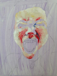
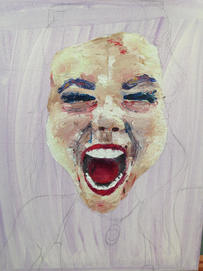
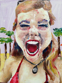
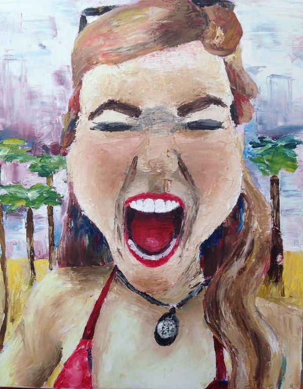
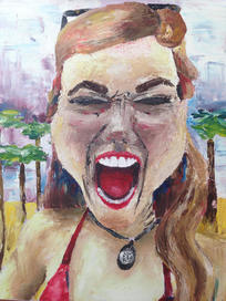
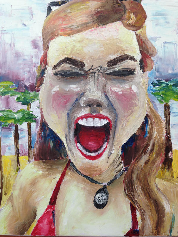
Palette Knife Portrait
|
|
|
|
|
|
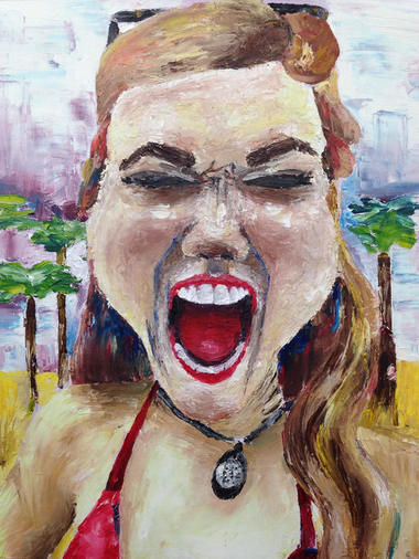
This was a painful painting that went through many different stages. Usually when a project annoys me like this one did, I work on it enough to get it to a point of satisfaction. I can't say that about this one. It looks okay, but too many things bother me about it. At the same time, I love certain parts of it and don't want to abandon the better parts. I really wanted to keep working on it until I was pleased with the whole thing. I think I was making it worse by continuing to mess with it, so I'm trying to use self control by leaving it alone, which is REALLY HARD TO DO. Okay, so I started out wanting to do a portrait just because I want to get better at doing people and faces. Art with people is my favorite, but it's hard. Then I wanted to continue to challenge myself by using a palette knife. My inspiration for this came from Sarah Dunn's palette knife portrait from last year that I love so much. I'm proud of myself for choosing to push myself, and I know I'm not too discouraged because I'm even more motivated to do another one now that I know what to do differently. I like the face the best in the second progress picture and wish I had left it at that. The third progress picture was my favorite day of working on it because I love how I did the body and bikini top. What I should've done is mix a lot of paint for the skin color so that everything matched. I should've taken more time to mix the face skin color and planned ahead more for my darks and lights to show up initially. With the body, I used the local skin color and got all the darks on the canvas. Then I just took put white everywhere else and was able to blend it together nicely. After I did that with the body, I thought I had figured out a good system, so I scraped some of the paint off and tried to use my new mastered palette knife methods on the face too. It sort of worked if you look at the fourth progress picture, but I then proceeded to go over everything once again, so it became just another lost stage before the final outcome. Overall, these are the things I like: the body (particularly the arm/shoulder), the bathing suit, the mouth the fact that I added a somewhat interesting background (AKA palm trees), the composition (I like it and I also think it's boring. I can't decide), and the challenge of it all; Things I hate include: the face's lack of appropriate lights and darks, the harsh lines between the eyes, the mix of blue and brown darks in the face, the top of the hair, the neck, and my mindset throughout this process. I hopefully won't have to include this in any portfolios, but it has character and acted as a necessary learning curve that resulted in disappointment nonetheless.
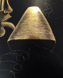
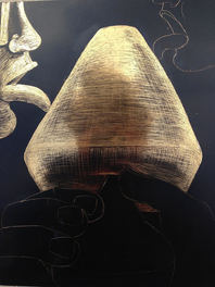
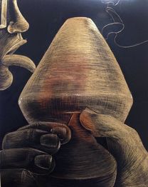
Foreshortening Scratchboard
|
|
|
|
After the long and frustrating time I had dealing with my palette knife painting, I was aching to do anything BUT a painting/anything involving color. Doing a scratchboard sounded like and fun and unique idea to me, so I decided to do the drawing class's foreshortening project. After trying to wrap my head around the concept of foreshortening for two full class periods, I was ready to start. Of course, the final result STILL doesn't look like extreme foreshortening.. just a cool perspective maybe. This project went by quickly, and it looks fine. I think I did a fine job with it, but it is quite boring to look at. Without colors to spice things up, AKA my usual way of drawing attention to my art, I should've compensated with a more interesting composition. It looked better in my sketches. I love the hand and Popsicle stick; I kept nice darks and used uniform lines. Now I understand the movement scratchboard project from last year and how the strokes really create movement in a scratchboard. I'm glad the hand and stick are the best part because it's pretty much the focal point. I knew before I started that it would be difficult not to get too dark too quickly, but it was still a challenge. There's definitely a range of values, but only three or four values when there should be nine. The faces are not the best, especially the top right one. They're very unrealistic and too big for the foreshortening perspective. Also, the Popsicle should be shaped differently to match the perspective I was aiming for. I loved my sketch for this project, and I should've followed it more closely. I tried to draw it out with pencil very lightly and then decided I didn't have to, but that was my first mistake. Completing this scratchboard was a nice, quick, fun thing to work on, and I don't dislike it. There's just nothing special about it.
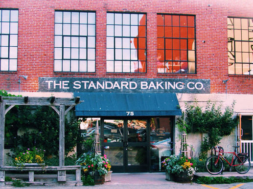
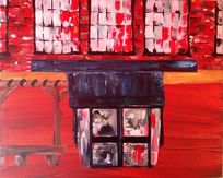
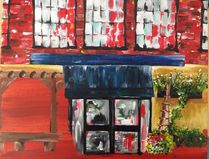
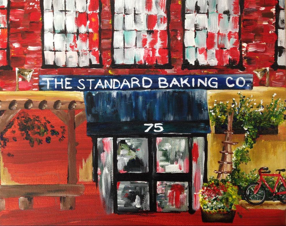
Bakery Storefront Acrylic
|
|
|
|
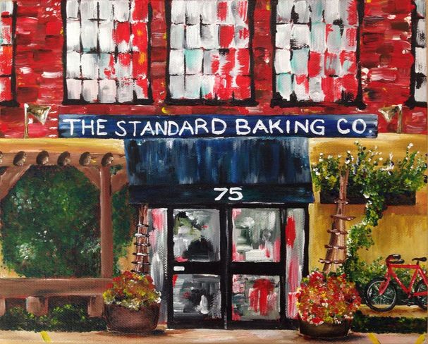
So I started this painting in August as my one and only real summer piece and, of course, didn't finish it until months later. I took this picture in Portland, Maine, when I was at camp during the summer. I love the picture and thought it would be a good landscape to paint. I wish this canvas was bigger- it was all I had at the time and couldn't be bothered to buy a different one, so I painted this on an 8x10. I sort of appreciate it though because I finished it quickly and got to use my tiny new brush for the whole thing. After completing this painting, I know acrylic paint is where I enjoy myself most. I looked forward to working on this each day and was back in my element after not using them for a while. I like the texture I got with my visible brush strokes, especially in the plants on the right. The text was challenging, as it always is, especially because this canvas was so small. I like how it turned out evenly spaced and uniform for the most part. I love the abstract qualities in the top half with the windows and bricks. Although I think it looks cool, I'm not sure how cohesive it is with the rest of the painting. I painted the top part and overhang and door back in August, and I might've had a different perspective when I finally came back to it last week. I combined two styles- a quick, colorful stroke style and a delicate, detailed style. I doubt it's something many people would notice, and it doesn't bother me much. It was fun not having to worry about blending or using the wrong color or smudging throughout this whole process. I like the wide color palette I used and my concentration on the primary colors. I hate the flower pot next to the bicycle. The flowers looked nice before I went over them and messed them up. Lucky me because I can go over it again and fix it. I love this painting- it's one of my favorites and I really didn't struggle much at all. It looks like something that belongs on a wall, so I'll probably hang it up in my kitchen or something. I'm excited to use more acrylics throughout the semester!
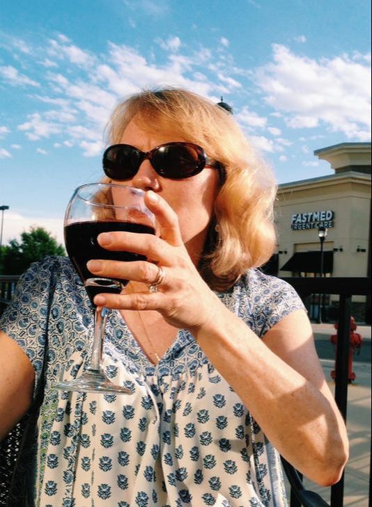
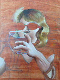
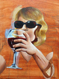
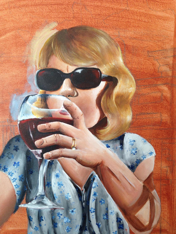
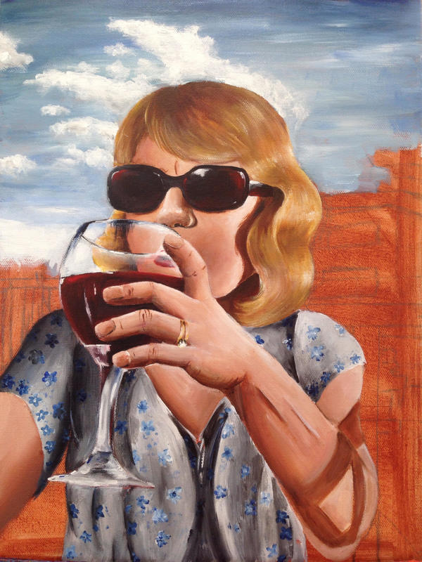
Wine Mom
|
|
|
|
|
|
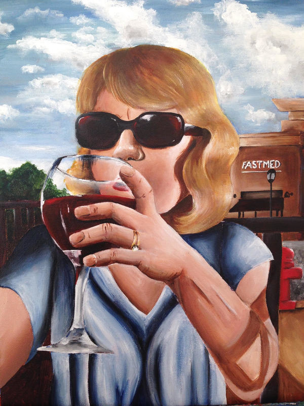
I took this picture of my mom outside Sushi Iwa last year. I got the picture published by an app and have always identified it as a cool photo, so it was time to paint it. I love the end result- I think it looks just like the photo, which is weird for me to say. It doesn't look too real, yet I've never painted anything so realistic. I would also say that it's the first successful portrait I've painted, so I'm happy about that. I started out with the hair and knew I was off to a pretty good start. I love the highlights and volume I was able to get. I broke the hair down into clumps of different values, and it was much easier from there. The top does look a bit flat, so I'm sure I should've added more highlights. Mixing paint for a skin color was difficult, as it always is. I settled on the color I used, and it doesn't look my mom's skin tone; nonetheless, it looks fine, and I'm okay with it. I spent an entire class period working on that dang nose, and it doesn't look terrible. I focused on it way too much because it's such a small aspect of the painting as a whole, and I'm probably the only person who would see anything wrong with it. I should've made the underneath a bit darker to get a more rounded shape. I love the different values on the face with the shading and highlights in the cheek and the shadow from the hair. I like the cool shadows on the arm and hand, especially the darkest part on the pinky side of the hand. I love the wine glass and sunglasses' color coordination- once Devin pointed it out, I went back and intensified the reds in both. My least favorite part is the fact that the shoulders are off. The head needs to be moved way to the left. It just looks very uneven and weird, but it's unchangeable. I also am not a fan of the shirt.. I redid it a few times, but getting the fabric to look right was much of a struggle to me. The pattern on the shirt made it hard to pick out the values, so I estimated a lot of it. I'm glad I painted the background from the picture because without it, it wouldn't remind me of the photo. I love this painting- it's one of my favorites. It isn't in my usual style, but it was fun to branch out and try to paint something realistic.
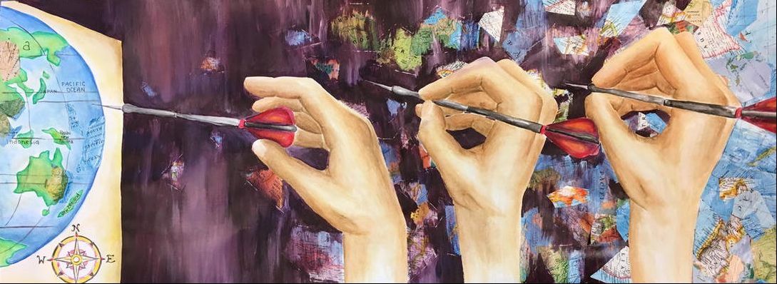
Destination Dreams
|
|
|
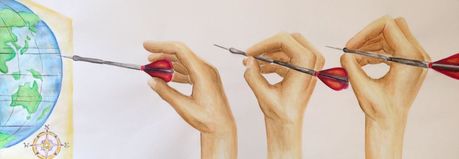
|
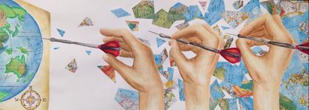
|
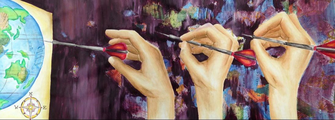
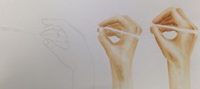
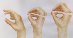
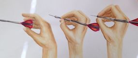
This is a mixed media for my concentration. My concentration revolves around freedom and how different people and things escape. I decided to draw a picture of a hand in motion as it throws a dart at a map, implying that wherever the dart lands is where the person will travel. A viewer can't tell where the dart lands, so that part is open to interpretation. This paper is just a huge, long rectangle, which was different and fun to work on. I originally planned on doing this whole thing in graphite, which is kind of funny considering how random and colorful it turned out. I started out by doing the hands with watercolor. I love the hands. Hands are usually a tough thing, but I think I drew them out nicely with the help of the reference pictures I took of my hand throwing a pencil across the room. I also LOVE the highlights- they give the hand a detailed bone structure near the wrist and at the joints. I added yellow to the highlights at the end, but you can't see it very well in the picture. The background is too dark, but at the same time I guess it emphasizes the hands and map, which are the focal points anyways. I wish I had made the maps in the background more visible and painted over them less, but I got carried away and then felt the need to even it out across the whole paper. My goal was to make the maps very concentrated on the right and fade out as they met the real map on the wall. In my last progress picture, I think it's so cool because it looks like shattered pieces of the world are either flying off the map or getting sucked into it. If I could do this over again, I would 100% leave the maps on the right and not paint over them. It's a gross color and you can't see the maps behind the purple wash. I think my reference picture before I painted the background looks so much better than the final because of the maps. Now that I'm writing this and looking back at it, I realize that I can just glue more maps over the ones on the right and revert it back more to the reference picture. I guess that's the magic of mixed media. Overall I love this, minus the crazy weird purple background. I've never been prouder of a watercolor piece. I also like my idea and composition and how it ties into my concentration. It's a good start to a long twelve pieces, but it gets me excited to see what else I come up with throughout next semester.
Updated pic^
Shelby Dog Portrait
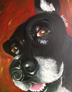
My best friend's dog died right before Christmas, so I decided to paint her and give it to her family as a Christmas present. It only took me about two hours and was just a quick little acrylic painting. I like the blue I added and the background color. Although it doesn't look realistic, it looks exactly like the real dog.
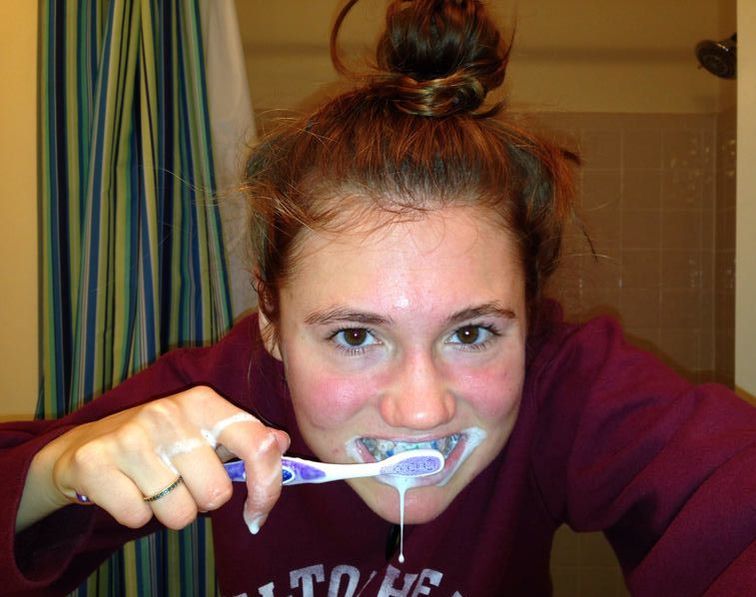
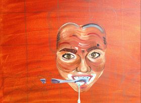
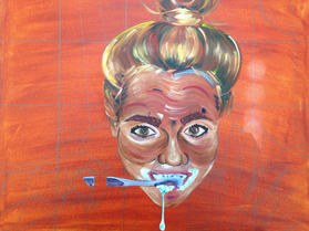
Brushing Teeth Portrait
|
|
|
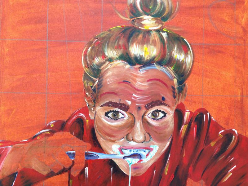
|
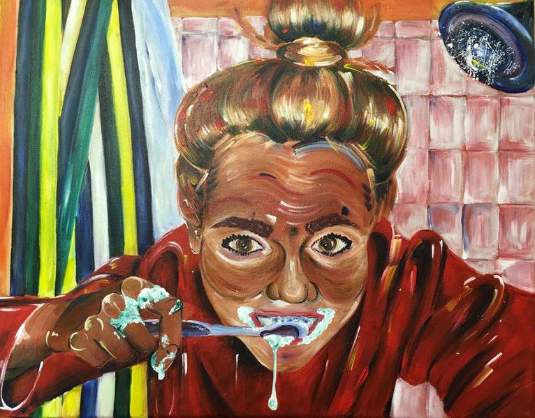
I wanted to do another self portrait this year because I had never done one that I liked until this one. It looks nothing like me, so I really wouldn't even call it a SELF portrait. I used acrylic, of course, because it's always my favorite. I was thinking about self portrait ideas a few weeks ago, apparently while I was brushing my teeth, and I took a picture and thought it would make a cool painting. This was super fun to make because I didn't allow myself to worry about using the right colors and what brush I was using and accuracy. I have the most fun with this kind of painting. I started out with the face and became excited about completing the rest of it because the face is the best part in my opinion. I mapped out basic shades, like how the bottom half of the face and eye areas should be lighter, and that was basically it. Then I made a half-mixed skin tone and tried to make my strokes very visible. I love the motion that is created from the strokes everywhere in the painting. I also really like the eyelashes and eyebrows and think blue outlines that I added for detail around the nose and eyes. The toothpaste is just big globs of white and blue-green paint that I dotted around. I also love the variety of colors in the hair and how I used my darks coming from the scalp and bun. The shirt looks fine, but fabric is always hard for me, and it was hard to get the folds to look right. The hand and shower curtain are my least favorite parts. The hand actually looks fine besides the index finger on the toothbrush. It looks like a weird mechanical finger that's not connected to the rest of the hand. I didn't draw it out well enough before painting, and when I got around to doing the hand, it was tough to eyeball the proportions. I like the values in the wrist and top of the hand and the toothpaste, but those fingers are not my favorite things to look at. They all need some more value and strokes to look less flat and match the rest of the skin on the face. The shower curtain looks very pastel-y and basic compared to the rest of the painting. There's not much texture, and I blended the colors too much. I love the tiles, so I half wished I had carried them out for the whole background, but I like the variety that the curtain offers to the composition. I love the circular strokes I used in the shower head, and I'm glad I decided to make it larger than in the picture. I splatter painted white to look like water droplets, and I think it adds a lot to the texture and background as a whole. Overall I think this painting is super cool for how long it took me. I also think it looks better in person and that this picture doesn't do it much justice. I will definitely be using it in my breadth because I think it represents my favorite painting style to use.
Concentration #2
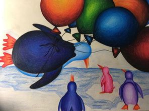
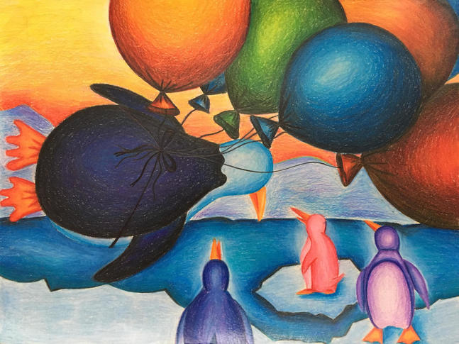
(I broke my phone and lost my in-progress pictures) So I've never been a fan of prismacolors, but I love my school bus drawing so I decided to try them out again this year. I also didn't want to transport canvases and brushes and paints etc. to and from school because I did that all of last week. I don't LOVE this drawing.. the idea is funny and fits my concentration and I love my composition, but I hate the way I executed it and the colors I chose. It's not how I pictured it turning out. First of all, I wanted to make the highlights on the balloons look much more dramatic, but as I blended and added more colors, I seemed to focus more on blending than on different values. Whenever I paint, I don't care about blending and I love the result, but when I use prismacolors, I seem to blend until the paper is waxy. I wanted the highlights on the penguins to be extreme as well. The water and ice and mountains and sky all look flat. I knew they looked flat and I proceeded to blend more because for some reason I couldn't help myself. I wasn't sure how to do the water and make the mountains look somewhat realistic. As you can see, I attempted to add different colors in different places, but it doesn't do anything. I will plan out my colors better next time. My favorite part is the composition and the overall idea. Because penguins can't fly, the balloons are allowing one penguin to fly while his other penguin friends are looking up in shock because they're jealous. My concentration could easily delve deep into political things and historical references and serious topics overall, and I like how I'm keeping it lighthearted so far. I also like the variety that this piece adds. I originally thought of it as a joke, but here we are. I almost always use multiple reference photos, but I don't think I used any for this. I'm proud of myself for being able to draw penguins from memory and put them all facing in different directions. I want to stray away from using so many reference photos and let my memory and creativity take over more often, so this was a good start. This is one of my least favorite things I've done this year, but I do still like it because I think it's funny and unique.
Final Reflection
This semester I've completed some of my favorite things I've ever done. It really wasn't much different from my other semesters in Art 4 except for the fact that I was in the painting class. I'm excited to be a part of the AP class this semester and to have that influence around me every day. Although I love Devin, I'm glad I'll soon have some more people who can give me feedback and advice on my artwork. I've been in Art 4/independent study classes so many times, and now it's the real deal. I always thought of previous semesters as my practice and experimental time to prepare for AP, but now I'm already halfway done. It's weird to think that I've already completed most of the pieces that will be going into my final portfolio. I think for this final semester I'll focus more on what I enjoy and what I know I'm good at. For example, no more experimenting with oils and prismacolors unless I really think it would work for the piece. My goal is to not get behind and rush my work, because that is my main problem. I usually get impatient with my artwork if it takes more than a week and a half. I also want to hold myself accountable for planning out my art just a little bit more. I really don't like to plan things out too much simply because I get excited and want to start things right away, but I know I will appreciate spending 30 minutes roughly planning and sketching before diving into my final projects. This past semester was a blur, but I made some art that I am excited to be including in my portfolio and excited to have completed. I discovered more about my style as an artist, and I want to let that lead me in the future.
