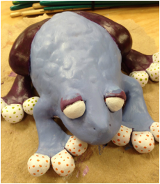
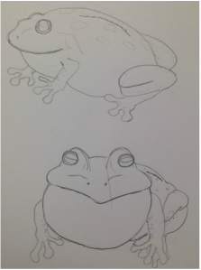
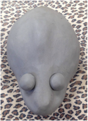
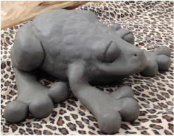
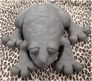
 After it was fired and I painted on a base layer of burnt sienna, I started painting it. These are the final pictures of my frog. Obviously I made the colors abstract and unrealistic to kind of go along with the fatness of it. I love how it turned out and I think it's really cute. When I was first starting to make it, I was unsure of how it was going to turn out because I didn't know how to make it any fatter than I had already made it and I was having trouble making its legs. Compared to the size of its legs the toes look super round and unproportional, and I know it wouldn't look as fat without them. Also the eyes are pretty big and bug-eyed, adding to the cartoon-ish look. I do think I could've made its body fatter, but at the same time I think I made the body big enough and it would've looked weird if I had made it any bigger. It looked rounder when I first made it because it was just two pinch pots, but it deflated and I crushed it a little bit in the process of adding the legs and eyes and texture on the back. It doesn't really resonate with Henry Moore's fat animals as much as it should, but I like how instead of making it bigger all around I just made some of the features stand out, making it look fatter. 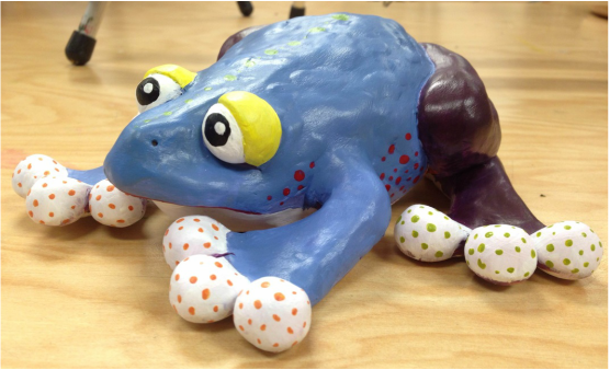
0 Comments
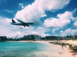 This is the reference picture I used. 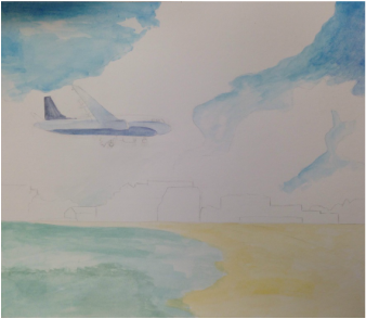 I started out with a mostly transparent layer over the whole thing to have a starting place with my colors. 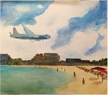 This is a little bit later after I added more value and details like the rocks and people and umbrellas. 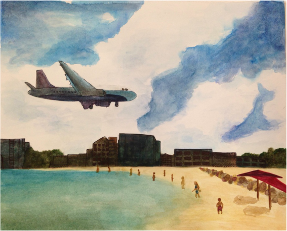 My main challenge in this painting was the plane. It was hard for me to make something so detailed with different colors not be too dark or blended together. I got some suggestions to use pen to add definition to the buildings and plane, and I think they both look much better after doing so. The buildings did turn out darker than I planned, but you can still see some varying values and details in them.
I think I did the best job with the water, people, and sky. I like how I blended the water and sand and how you can see the darker and lighter parts of the ocean. I thought the people would be really difficult because they're so small, but I kept it simple and they turned out pretty well. I liked blending blues and purples and greens to make the sky. I added some shadows around the edges of the clouds and made the sky a deeper color farther away from the clouds. I improved my watercolor skills as I continued to paint this, I made sure not to get too dark too fast and to use transparent layers. I did get a little too dark with the buildings, but I think it looks cool next to the white sky. I used pen on the buildings and plane for detail, and I used salt on the rocks to add texture. I think the salt looks really cool and I'm glad I used it. Unlike my last watercolor, they were no spots where the paper got messed up because of using too much water. |
AuthorWrite something about yourself. No need to be fancy, just an overview. Archives
June 2016
Categories |
 RSS Feed
