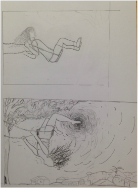
 This was when I was about halfway done. It took a long time to do all of the leaves because there are so many and I had to do individual details and values for each one. 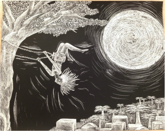 I really like the idea of this picture, and I like how I combined a bunch of reference pictures I saw and made my own kind of image. I planned for the moon to be smaller, as you can tell from my composition sketch, because I wanted the main focus to be on the girl, but then I didn't want the city to be any bigger and I needed to fill the space. I think it still looks good and adds brightness. At first I just wanted the girl's hair to be super curly, but then I decided to make her have dreads instead. I don't know how evident it is that her hair is dreads, but I think it looks cool.
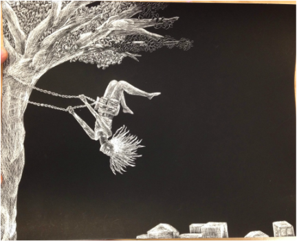
This was my first scratch board, and it wasn't that hard and turned out well. Aside from being tedious, I liked making it and I can see how it's great for texture. I don't like doing black and white things as much as I like doing things in color, but it was fun and different to do a scratch board because everything is either black or white and it's fun get different values from it. I had to stop and look back at what I was working on a lot during the process to make sure I didn't want to get too white at any part. Nothing got too white except for maybe the hair and parts of the tree. My favorite part of the tree bark is the branches at the top right because of the different values, and I wish I had done that throughout the whole tree. I also wish I had stuck with scratching in the same direction on the tree because it doesn't look very realistic or textured and looks random. I love the leaves because up close you can see the detail in each leaf and I really tried keeping the varying values in. The only thing I'd change about the leaves is to add more in the middle instead of having an open space with just the trunk. I also really like the building and palm tree combination with the grass. I like how the buildings aren't detailed with windows or anything but have shading. The trees and grass have a good texture that I like. I was skeptical to add a face to the girl, but I added eyes and eyebrows and ears lightly and I think it looks way better than it would have with just an empty face.
0 Comments
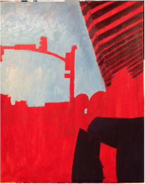 After I painted a red base all over, I started painting the sky, my leggings, and the overhang thing. I figured I'd start out with the least detailed parts of the picture. 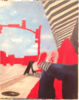 Here I finished the overhang, painted a first layer of paint on the sidewalk and street, and added more value to the leggings. 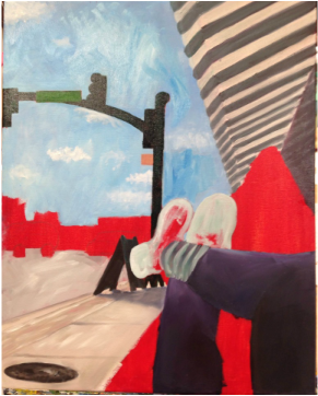 While I was doing the traffic light I smudged part of the sky and tried to fix it up, but it only looked worse so I decided to leave and go back to it later. 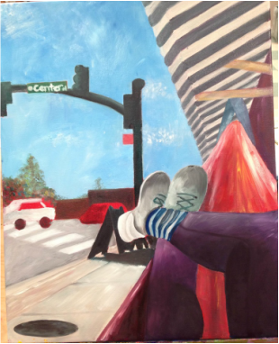 At this point I had covered most of the canvas in paint, but I still had to add more details and fix some parts up. 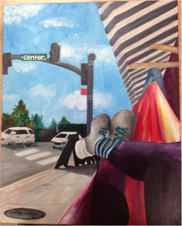 This is my first oil painting, so a lot of this process was just learning how to use the oils. You can see my progression in the painting itself. The hammock,one of the last things I did, is one of my favorite parts because of the bright color scheme and streaks. I also really like the street and sidewalk because of the different colors I incorporated. I learned that oils are easily blended and that it instead of completely mixing the colors I was using to get one color, it's better to just have all the colors peeking through.
I had the most trouble with the perspective of the legs and getting the shoes to look real. I think the leg perspective looks pretty good and that I succeeded in showing the highlights and shadows without using any black. I really like the white part of the shoe on the left because of the shadows, and I like the shape of both of the shoes, but I could've added more detail or different shades to make them look more realistic. The shadow on the advertisement stand thing was hard because I made it a little too big but didn't bother going back to fix it because I knew I'd mess up the sidewalk in the process. I do, however, like the different values in the shadow. Coming from only using acrylic paints previously, the fact that oils basically don't dry became a challenge as I worked. I kept trying to touch up little things and messing them up because I'd smear a bigger area than I was trying to fix in the first place. I learned to just go with my mistakes and layer. I love how the colors turned out in every part of the painting, and I can see how oils are really fun and freeing with the layers of paint and blending and brightness of it all.
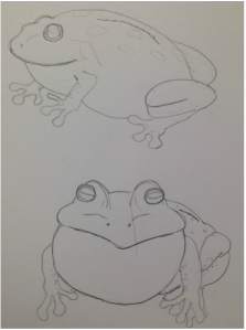
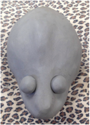
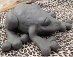
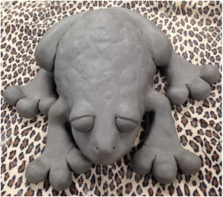
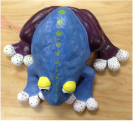
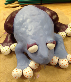 After it was fired and I painted on a base layer of burnt sienna, I started painting it. These are the final pictures of my frog. Obviously I made the colors abstract and unrealistic to kind of go along with the fatness of it. I love how it turned out and I think it's really cute. When I was first starting to make it, I was unsure of how it was going to turn out because I didn't know how to make it any fatter than I had already made it and I was having trouble making its legs. Compared to the size of its legs the toes look super round and unproportional, and I know it wouldn't look as fat without them. Also the eyes are pretty big and bug-eyed, adding to the cartoon-ish look. I do think I could've made its body fatter, but at the same time I think I made the body big enough and it would've looked weird if I had made it any bigger. It looked rounder when I first made it because it was just two pinch pots, but it deflated and I crushed it a little bit in the process of adding the legs and eyes and texture on the back. It doesn't really resonate with Henry Moore's fat animals as much as it should, but I like how instead of making it bigger all around I just made some of the features stand out, making it look fatter. 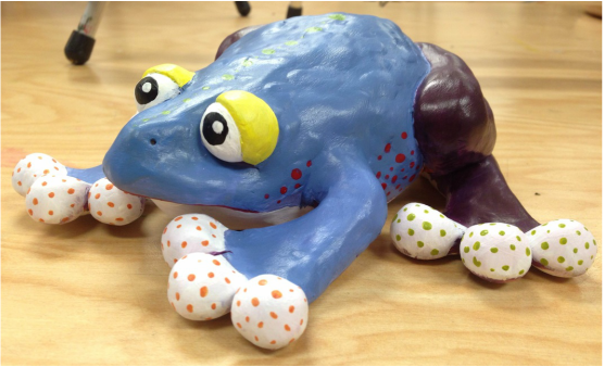
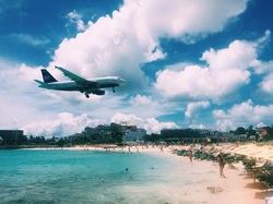 This is the reference picture I used. 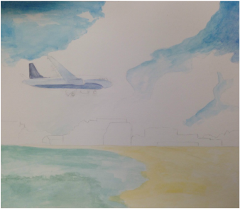 I started out with a mostly transparent layer over the whole thing to have a starting place with my colors. 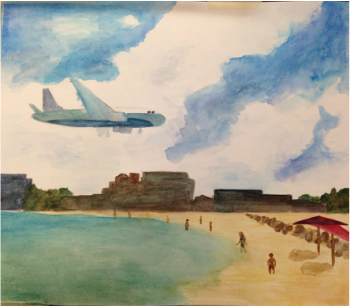 This is a little bit later after I added more value and details like the rocks and people and umbrellas. 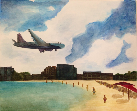 My main challenge in this painting was the plane. It was hard for me to make something so detailed with different colors not be too dark or blended together. I got some suggestions to use pen to add definition to the buildings and plane, and I think they both look much better after doing so. The buildings did turn out darker than I planned, but you can still see some varying values and details in them.
I think I did the best job with the water, people, and sky. I like how I blended the water and sand and how you can see the darker and lighter parts of the ocean. I thought the people would be really difficult because they're so small, but I kept it simple and they turned out pretty well. I liked blending blues and purples and greens to make the sky. I added some shadows around the edges of the clouds and made the sky a deeper color farther away from the clouds. I improved my watercolor skills as I continued to paint this, I made sure not to get too dark too fast and to use transparent layers. I did get a little too dark with the buildings, but I think it looks cool next to the white sky. I used pen on the buildings and plane for detail, and I used salt on the rocks to add texture. I think the salt looks really cool and I'm glad I used it. Unlike my last watercolor, they were no spots where the paper got messed up because of using too much water. 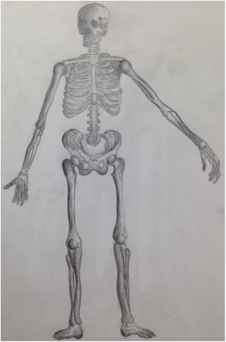 This is a skeleton drawing I did with pencil. I think it turned out pretty well because everything is in proportion, and I like the shading I did on the arms and legs.
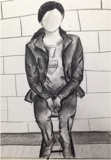
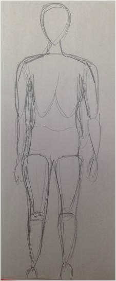
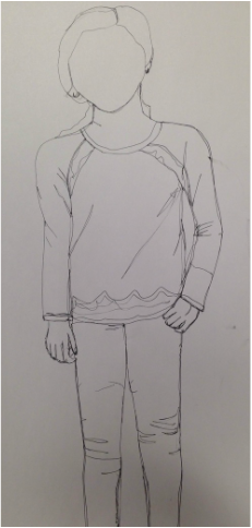 This is the first full-body contour drawing I did. I drew it in pen, so I had to pay attention to the proportions because the lines I was making were pretty much irreversible. Aside from that, I loved using the pen because it seems like it would be 2-D, but I like that you can really focus on the details and creating them without adding value. I think it looks good, but the legs are a little too small. I also could've added a background and drawn more of the folds and detail in the clothing and hair because it looks pretty boring just as it is. 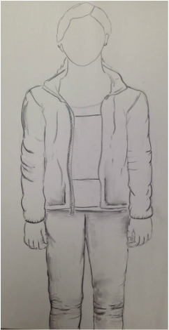 This is the last practice drawing I did before attempting my final. I like this one way better than the first and I can see my improvement. For one, using pencil instead of pen helped a lot because I could get things more how I wanted them. I also added value using different charcoals, and even though I only spent five minutes shading, you can already see the depth. I like how you can tell how thick the jacket is, and I think I did a good job on the hands, something I thought would be difficult. Obviously these drawings would look different from each other anyways just because of the different media used, but I love doing these drawings because they're quick and fun, and you can't tell that they only took twenty or so minutes to do.
|
AuthorWrite something about yourself. No need to be fancy, just an overview. Archives
June 2016
Categories |
 RSS Feed
