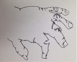
Blind Contour
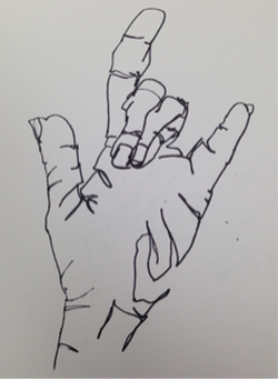
These are my two best blind contour
hand drawings. They got easier as I did more practices and moved my pen more slowly. |
|
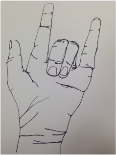
Modified Contour
|
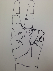
These are my two modified contour drawings. It was obviously easier to draw them while looking, but still difficult to try to get details without lifting up my pen.
|
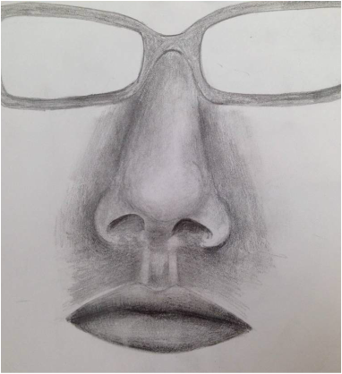
Backpack Contour
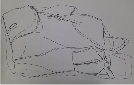
This is a modified contour of my backpack. I think it looks cool and everything is in proportion, but I definitely could've added more details with the folds in the fabric.
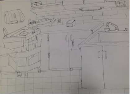
Room Contour Practices
|
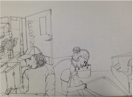
These are the two practices I did before attempting my final room contour. I like the composition of the first one better because even though the people look weird, I think it adds a lot. Also the second one doesn't show much depth.
|
Final Contour
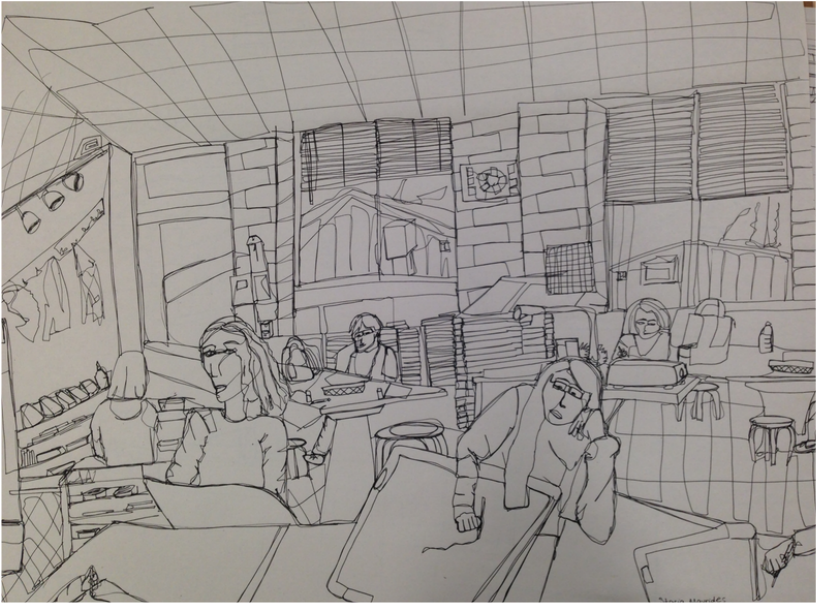
This is my final contour drawing of the art room. I think I did a good job of using a fluid line throughout this, and it's evident where I had to come in to add lines and then trace over it to go back, like in the clothing.. I think I got sloppy with going back over my lines so many times towards the end, like on the ceiling and floor tiles. Practicing contour drawings helped the final because I learned that it looks better to just include every detail you see, even if it doesn't look like you want it to. For example, I drew in little things like glue sticks on the table and panels on the trailers outside. It also helped me to decide on the scene I drew because I learned that I wanted a scene that featured people and a lot of different elements. I knew I'd rather tackle a busy scene than add in a lot of detail to a more specific one. I like how you have to really look at the picture to figure out what each thing is and that it isn't initially so realistic and obvious. My contour line drawing is different from an outline drawing because it drew this whole scene pretty much without picking up my pen. Instead of making an outline and skipping around and going back in to add details, I started on one side of the page and pretty much worked my way around the paper and added all the details as I saw them. Line interpretation becomes important in contour drawings because all that the drawing consists of is one big line. You kind of have to change your mindset while drawing because instead of shading in a shadow, for instance, you would draw the outline of the shadow. I like the depth that my drawing shows, but I think my perspective is way off. I should've thought about it more before drawing it because although the foreground and background objects are to scale, the left corner of the room and floor tiles look really weird and mess up the picture.
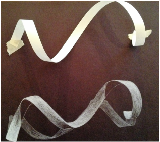
This was my "ribbon" practice with the white charcoal on black paper.
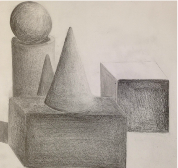
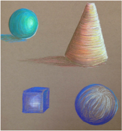
This was my shading shapes pencil practice. It helped me figure out how to use my new shading pencils and when to use the darker and lighter ones. I didn't have time to finish the cube or add more shadows.
Still Life
|
|
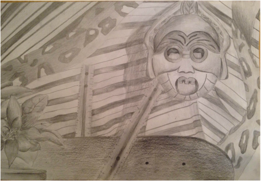
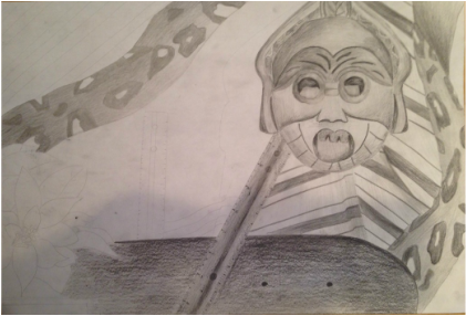
Honestly I didn't spend any time on this and I know I could've done much better. I'm not a fan of pencil shading, especially on a giant paper with a subject matter that I'm not interested in. This entire process was just me reluctantly shading large portions and not paying much attention to detail. I like that it was an observational drawing because I feel like you can get more detailed with having the subject matter right in front of you and not on a tiny picture. I really like my composition, which my compositional sketches helped out with. My favorite sections of the drawing are the flowers, mask, and ribbon. I think the main reason I don't really like it is because I only included like four different values and don't have any highlights or good shadows, which makes it look flat. There isn't a clear source of lighting, which is something I could easily fix, so I'll definitely go back and more darks and lights. Other than that, I think it turned out decently. Everything is drawn out to scale and the perspective looks good. I feel like the viewer's eye would automatically go to the mask just because it's the most interesting part of the picture, but then they see all the other elements like the flowers in the corner and how the ribbons are all twisted up. Before this project I had never used real drawing pencils before, so it was fun to experiment with the different values that each pencil has to offer.
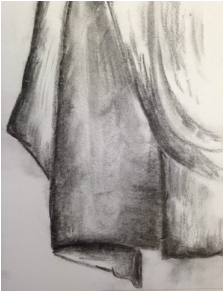
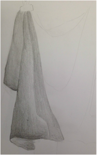
Fabric Practice
I did three fabric practices before beginning my final. The first one was done in vine charcoal, the second was done in pencil, and the third was done in charcoal pencil. The practices helped me figure out that I wanted to use charcoal pencil for my final.
|
|
|
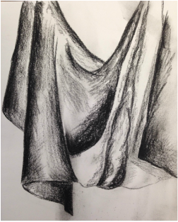
Charcoal Fabric
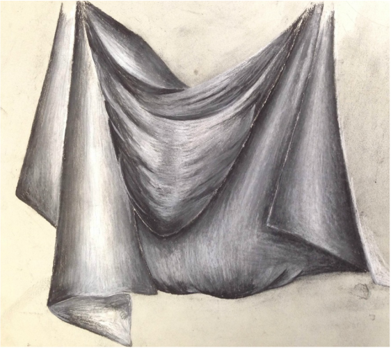
I love this drawing and it's because I used a wide range of values. I think I did well with showing the movement of the sheet and highlighting where the light hit. The main reason I like this is because I don't like charcoal and its messiness and over-blending qualities, but I avoided those things and kept a lot of the values. The practices helped me with this because it helped me remember just how easily charcoal drawings can turn muddy. Shading with the direction of the fabric shows the movement and makes things look 3-D. The left half and middle dip in the fabric are my favorite parts because they have good highlights with the white charcoal, so I would carry that out to the rest of it if I were to do it over again. I got too dark too quickly with the part on the right and that made it difficult to try to add white. Also just looking at this picture I see that I need to erase all the smudges in the background and clean it up.
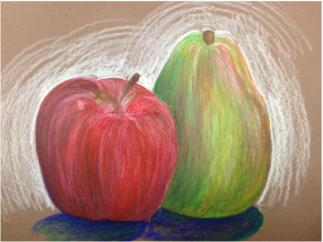
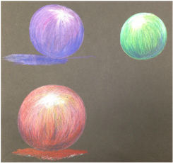
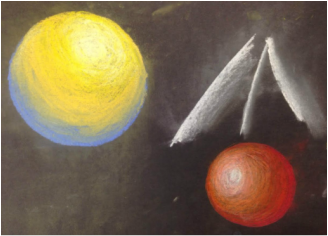
Prisma Color Practice
|
|
|
These practices helped me to get more practice with blending and incorporating lot of colors into "solid" colored things. For the fruits I tried to bring the reds out in the pear and bring the greens out in the apple to create a uniform look.
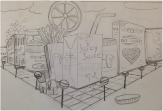
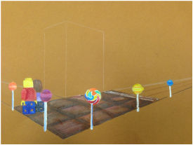
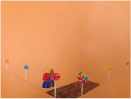
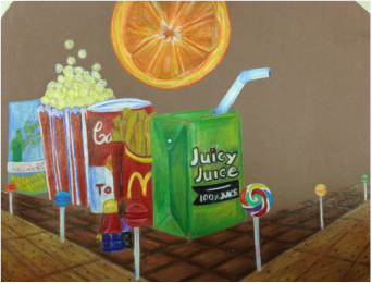
Food City-Perspective
|
|
|
I had to restart twice because I used pastel paper at first and then weird construction paper with no texture the second time.
|
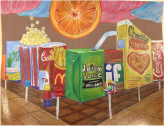
|
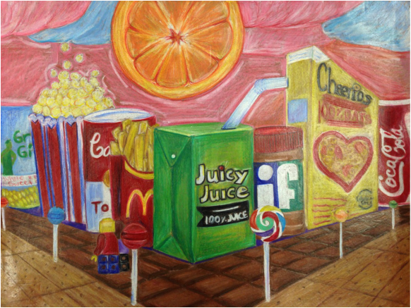
I think what makes this piece interesting isn't the point of view as much as the variety of foods and colors. The perspective was easy to achieve because it's just a two-point and everything easily went back to the vanishing point. It's important to understand perspective for every type of drawing because every angle for every scene in real life is in perspective. Since everything is in perspective, so in order to get things realistic looking, there has to be some type proportion. The colored pencil exercises were important because they helped me to further figure out how to get different values. I had higher expectations for this project than how it turned out. I do like the colors I used and how many different elements there are to the drawing. I like the movement in the chocolate bar sidewalk and I like the lollipops and Lego people. I think I achieved a nice foreground, middle ground, and background by adding the lollipops and having the Legos overlapping with them and then the overlapping buildings and orange in the sky. The depth definitely could be improved with a wider range of values, and that's the number one thing about this piece that I'd fix. I like the idea of this drawing so much that at some point I want to redo the whole thing because I know there's more potential to it. I think everything looks really soft and flat because there are no shadows or highlights. There definitely need to be shadows between the "buildings" and under them and under the people. I didn't really think about shadows until I had made everything really shiny and couldn't go back over it very well. Also the Juicy Juice label isn't in proportion and I think the juice box would be my favorite part if that aspect of it was fixed. I love the orange slice for the sun and I like the different colors I was able to incorporate. The sky is supposed to be cotton candy, and I should've practiced drawing it before adding it on my final because it doesn't look like cotton candy. I would also change the composition and make the street corner more off-center. I like the direction my composition was going in my first version of this when I used the pastel paper and the corner was a little more to the left. Other than that I think the composition is great with the different elements and filled page. Overall I love the idea of this drawing and I know I could've done a lot better with it if I had just worked more carefully and taken shadows into consideration.
Candy Prismacolor
|
|
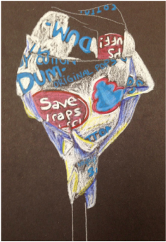
|
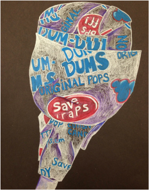
|
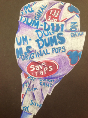
|
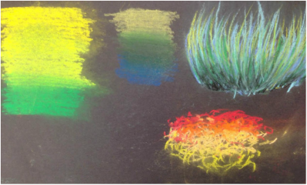
Chalk Practices
|
|
These practices taught me different techniques with the chalk and when to use the chalk pastels versus the pencils. I learned not to press too heavily and that you can't really blend your colors too much without rubbing the color completely off.
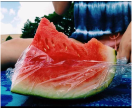
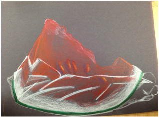
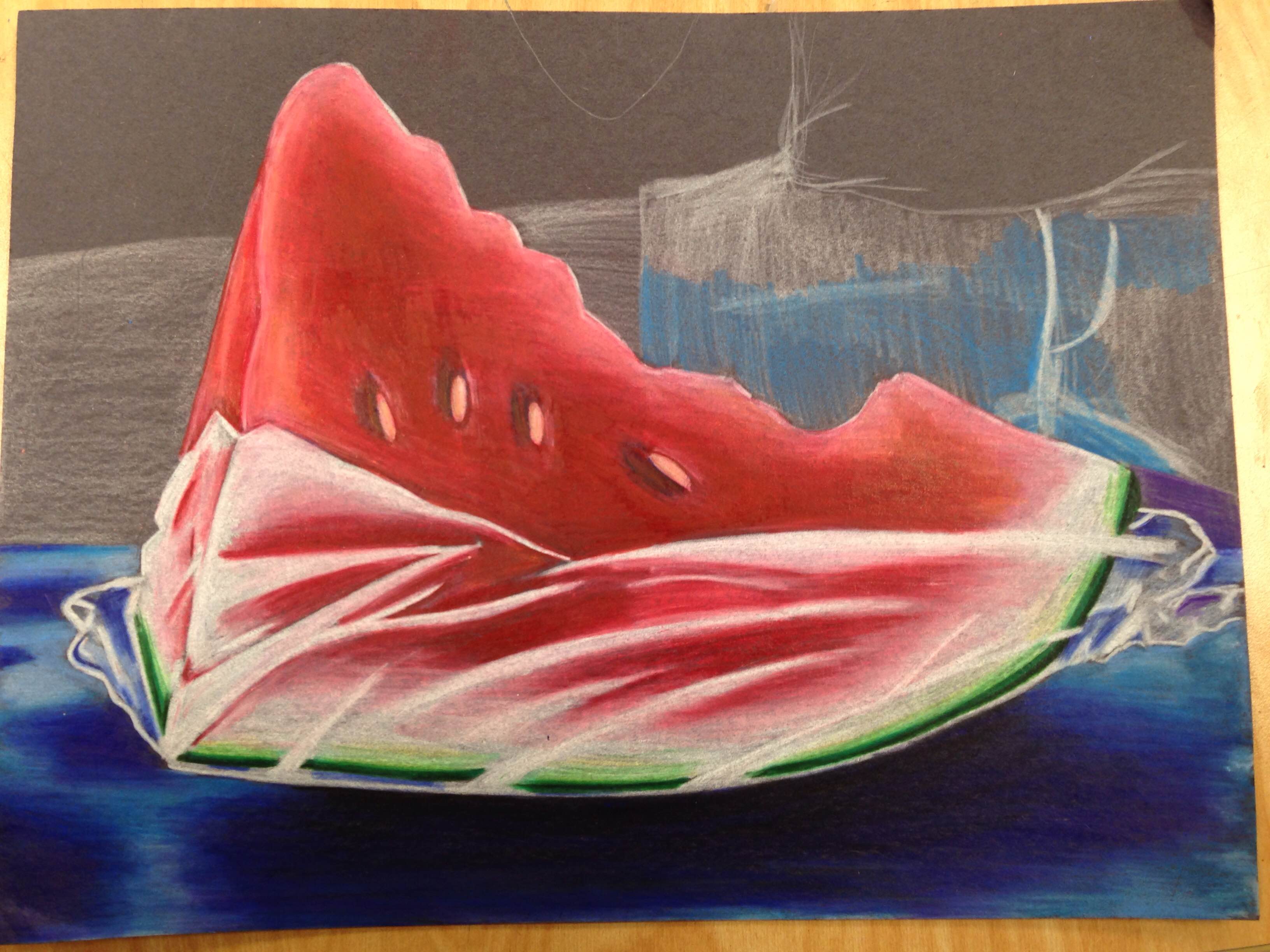
Watermelon Opacity
|
|
|
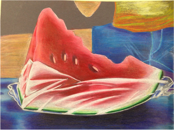
This is pretty neat, minus the shirt and the fact that I haven't finished yet. I really like the foreground, and I like the background in my reference photo, but I messed up the shorts and then mostly gave up after that. I found it difficult to get a good skin color because 1) I haven't used Prismacolors very much and don't usually use that accurate of colors anyways and 2) I think it looks too orange and I should add a tiny bit more blue. I think because I didn't draw the jeans very well that it's hard to tell what's going on in the background. It looks like the shorts are a part of the towel because it's basically all the same color. I think the colors of the towel work well to contrast with the red and orange of the watermelon. My plan with the orange/yellow shirt was to contrast the blue in the shorts. I really blended the plastic wrap with the watermelon to show the texture and that it was transparent. I used different values in the watermelon, just like in real life with the deep reds in the middle and lighter parts on the edge and near the rind, to make it look more realistic. I used my black pencil for the first time ever with this project because I couldn't get a dark enough shadow underneath the watermelon with my usual purples and navy. It's important to understand how to blend Prismas and incorporate multiple colors. I learned with this project that it's important to work in light layers, something that I knew before but didn't follow with this project. If I had worked lighter when trying to get a good jeans color, it wouldn't have been too waxy and I could've kept adding to get it just right. It's also important to understand color combining, like with the skin color I was making. To improve this I could add more blue and white to the skin and finish adding in the top left background.
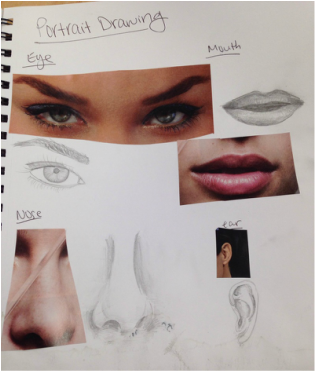
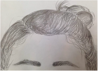
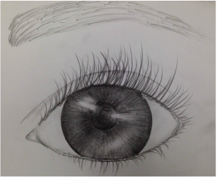
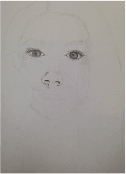
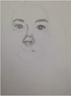
Portraiture Practice
|
|
|
|
|
|
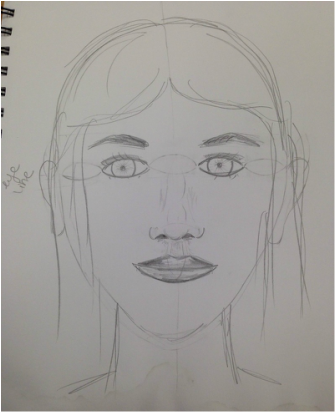
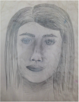
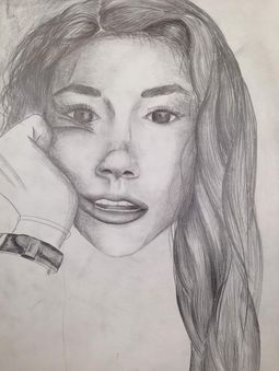
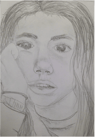
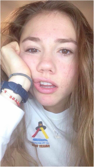
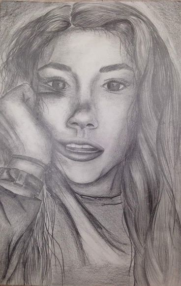
Expressive Self Portrait
|
|
|
|
This is the first realistic self portrait that I've done. I still need to go back and add darker values and lighten up the highlights that got smudged. Whenever I look at it, all I see is the super long nose. I should've measured things out better to make sure the nose was in proportion because the bottom of the nose should be basically at the top of the ball of my nose in the picture. Since my face is all scrunched up, my nose should also be even less shapely and not as straight. It's something that I couldn't really fix without changing everything. The hair turned out really nice considering it was my first time doing hair, although I still need to go back and add darker values to it. In the videos we watched, one guy said that it's easiest to section off the hair and add value that way, so that's pretty much what I did. I like the loose pieces of hair that I added towards the end because it added a lot, I think, to the overall drawing and made it more realistic because things didn't look so uniform anymore. Hands are really tricky and usually look weird, but I think I did a pretty good job with the one in the picture. The eyes look good-ish but not really because they kind of just look fake. They don't look like my eyes. The eyelashes should be longer, and the eyes should have darker values, especially the right eye. Neither eye looks like it's 3-D or set back into the head- they look like they're just sitting on the surface of my face. The shirt was something that I clearly rushed at the end, but honestly I'm not even sure I could've done it much better. I need to practice drawing fabric again and make the folds better. I feel like teeth usually look weird in drawings, but I don't think mine do. All I did was outline them with a really sharp pencil and then erase inside to get a highlight. I also like the shape and highlights in my lips. I like the area below the nose down to my chin. I also love the top half of my face because I think my eyebrows look exactly like my eyebrows in real life. I'm happy with how dimensional the face looks, and I like the darker values I put around my face, like on the right jaw line area and how the brow bone looks curved. I think I put nice value and really took into account where the shadows are. Overall I think I have a decent range of values, but I need more super darks and highlights and for things to be blended out better. I paid attention to detail, but I also didn't work off the reference photo as much as I should have. For someone who doesn't know what I look like, this drawing is probably a little bit more impressive, but I'm decently happy about how it turned out. Next time I do a portrait I'd like to try the grid method because that seems like it would force everything into perspective, which was my main problem with this drawing. I'll post an updated picture of this once I add a wider range of values and fix up the shirt and possibly the eyes!
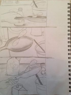
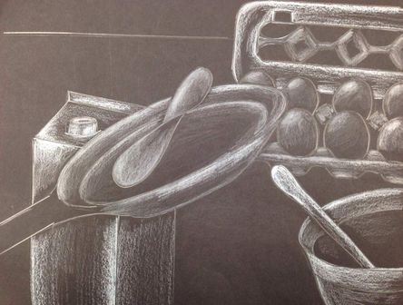
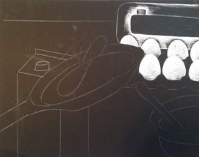
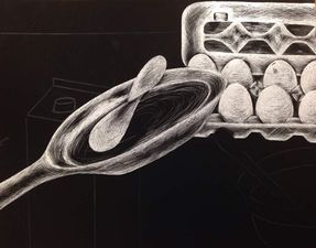
Pancake Scratchboard
|
|
|
|
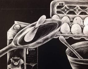
|
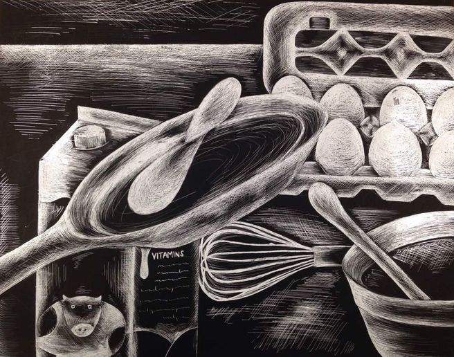
This is my second time doing this project, and I can successfully say that although I love how both of them turned out, scratchboard is a long and tedious process that I'm not a fan of. I love the look of scratchboard and how you can get so detailed with it, so I'm sure I'll be doing more in the future. I was so cautious to make the first scratches on this, and by the end I think I was getting almost too careless. My favorite part is the carton of eggs. It really stands out to me because I think I got the shape of everything pretty well and the brightness of the eggs makes them stand out. Honestly I really like everything except the majority of the pan and the pancake, which is unfortunate because that was supposed to be the focus point. With adding everything else, I don't think it acts as a strong focus point anymore, which I'm definitely okay with. The shape of the pan is way off- with the way the bottom of the pan near the handle looks, I should've made more of the pan surface showing and hardly any of the bottom edge like I did. I also scratched away too much at that one spot behind the pancake, but I don't think it's that noticeable. The pancake itself has a weird shape, but I don't really know how else I would've drawn it. I just would've added more pancake-y things like darker/lighter spots and given it a wider range of values. I really like the cow on the milk carton and the text on the side and the direction in which I scratched. The same thing goes for the bowl- I like how I only scratched in one direction to show the round shape and where I added the highlights. The whisk was a last-minute decision because there was a big spot of empty space where I didn't just want to randomly crosshatch the counter top. I like the shape of the whisk and how white it is, and then how the handle has all the lines going on the same direction and how I left a lot of it black. I'm glad I added it because, although I liked the composition before, now there's something took at it in pretty much every part of the paper. I almost added a syrup bottle or something in the top left corner, but I'm really gad I didn't because it would've looked way too hectic. I think the way it looks now has a good amount of balance with things going off the page etc. Overall what I learned from this was that the direction of your scratches is just as a important as the amount of value you add. My favorite parts are my favorite because of the way I scratched and the shapes it gave the objects. The spots where I scratched in more than three or so directions look a little crazy and not the look I was going for. I really like how this turned out, and I want to try another one with a subject that's close-up so that I can make it really detailed.
