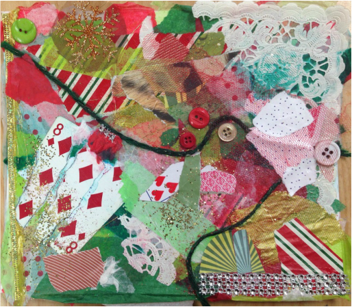
 In the beginning, I wasn't thinking too much about color schemes or anything. Towards the end is when I started considering placement more and developed a theme. My inspiration came mainly from my surroundings. I saw that I was using a lot of Christmas-y materials, and it was right before Christmas break, so I thought to make it Christmas-themed altogether. Since it was still an abstract project, I tried using reds and greens and whites to give it the Christmas vibe and not be overpowering with my theme. I think it looks really nice because there's a lot going on with the complementary colors and mesh and glitter, but you can still see the different elements that are a part of it. I don't think it looks too in-your-face because I thought about the placement of objects and what they'd add to the composition overall.
Learning technique wasn't a major component of this project for me, but I did learn that you still have to think about what you're doing even when you're creating an abstract piece of art. It was fun exploring the different media and trying to tie them all together on a little piece of cardboard. It seems like it's totally random, but it wouldn't be at all as aesthetically pleasing if it was random, so you really need to think about what you're doing (more than I thought you'd have to). I think the yarn going across the paper adds a lot because it divides things and allows you to focus more on the separate halves, even though it all goes together. I had the striped wrapping paper be perpendicular to the yarn because I wanted to break up the movement and not have the only lines on the paper all going in the same direction. I like the white lace in the corner because it breaks up the reds and greens on that half and adds more texture, and I like that I made it so big and then covered up parts of it. I really like the piece of animal-printed paper towards the top because it's kind of unexpected and doesn't totally go with the theme, but doesn't really look out-of-place either.
0 Comments
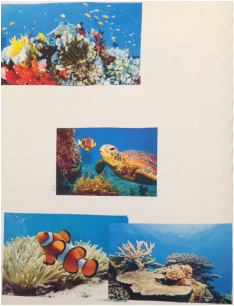
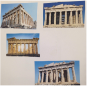
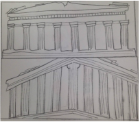
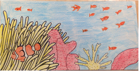 These are my references and sketches of my two options I was deciding between in the beginning. I knew I wanted to do the Great Barrier Reef because it would have a more interesting composition, but I also considered doing the Parthenon because I thought it would be fun to make it unrealistically colorful. 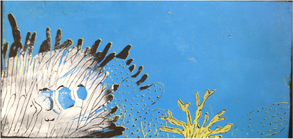 I originally meant for the sea anemone to be yellow, but I started carving it out before realizing what I was doing. I thought I only needed the fish's stripes to be white, so I didn't cover my whole linoleum in the ink, hence part of the sea anemone doesn't have any ink. Aside from that, at this point I was about halfway done having done three out of the six colors. 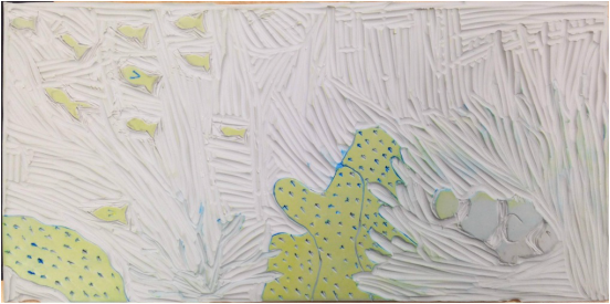 This is my linoleum after printing the yellow parts and cutting them away and before printing the pink layer. 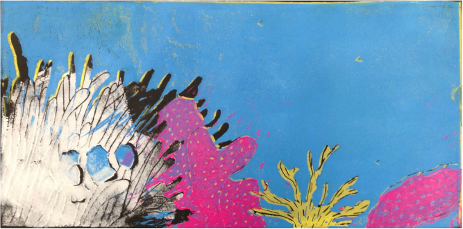 This is after printing the pink. 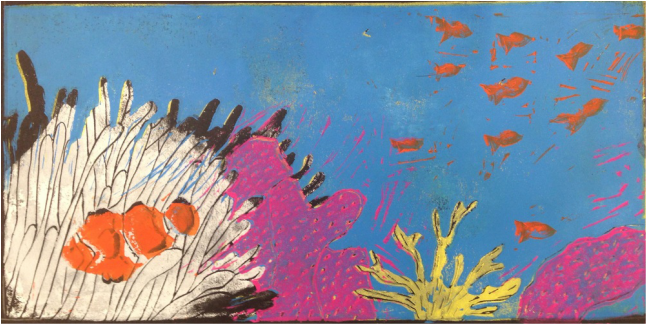 Looking back on this project, I definitely would've worked more carefully. If I were to redo any part of this project, I'd make sure to think about the carving process before just going for it because that's what messed me up the most and made it look incomplete. I should've considered what would result from each thing I did, because the whole carving concept already confused me from the beginning. I also think I could've made more of an effort to line it up well, because some of my worse prints would be some of my best ones if it weren't for things not lining up. I picked this print, number two, as my best mainly because everything was lined up how I wanted it. For this particular print, I think I should've added more ink on the pink layer because there would be no traces of blue showing through.
I responded to problems I encountered by basically just fixing whatever went wrong on the next print/color. One thing I loved about this project was that we made more than one print, so I could mess up on one and fix it next time. This made it really fun to see how each one turned out differently. For example, I could see that the ink looked more vibrant on my final colors and my fourth, fifth, and sixth prints. My work took an unexpected turn when I started carving out the wrong part. There wasn't much I could do about it, but I figured I'd just continue cutting it out and make that part a different color from what I originally intended. If it weren't for me not covering the whole paper in ink for my first layer, no one would've even known I messed up. This was my first time doing printmaking, and my final project definitely didn't turn out how I thought it would. I think I did a decent job and I like it overall, but I know I could do a much better job if I were to do it again. I learned how and what to carve, how much ink to use, and how to line up my paper and linoleum. Using different-sized tools to cut away the linoleum helped me to work more efficiently and control my carving. At first I wasn't using enough ink, and I found out how much to use and that it looks ten times better when you use enough. I tried placing the paper on the linoleum and placing the linoleum on the paper and found out what worked best for me. This was one of the projects I got more out of because it was so new to me in the beginning and I learned by trial and error. |